The IoT is a network that allows sensors and Web-enabled devices and systems — the things — to communicate with one another. GIS extends the reach and visibility of IoT data. Sure, it’s wonderful that we have IoT networks transmitting real-time information between systems and other “things,” but what’s the best way to actually express and consume the data that’s constantly streaming? I believe that maps are the best way to see and access that data. Maps complete the picture of all those related objects, binding the information together, telling the real-time story of everything we need to be aware of, from snowplow fleets to floods. The map is the key to expressing the data and making communities smarter.
Everything About Snowplows
A community’s snow fleets are technical marvels. They have GPS transmitting their location in real time. They have sensors that show those back at the office if the plow is up or down. They have machines that gauge the amount of salt they dispense. With every truck in a typical state’s snow fleet equipped with sensors and communication equipment, departments of transportation (DOT) are primed to know the story of their trucks. For example, sensor data from the fleets can be fed into a digital map so that managers can know more about salt distribution in relation to snow-impacted areas.Imagine how much is saved when you know precisely where to salt and how much of it to lay down. Now that’s a story, and it’s made possible my merging the sensor data with the map. The story of the trucks would be scattered throughout the enterprise and hard to know. Without a system to aggregate, visualize and make sense of it, to what avail is all that streaming intelligence?
Departments like the Iowa DOT and local government public works organizations have fully incorporated GIS, GPS and automatic vehicle location technologies into their vehicles to improve field-to-office and public communication. Maps enable the communication and serve as the windows into the IoT data.
The Iowa DOT snow fleets now constantly stream fleet data on speed, location and material release rates into the department’s centralized database for processing and publishing in a map. All the data those vehicles gather instantly transforms into a dynamic layer in the DOT’s public-facing plow-tracking map. Additional pieces of Iowa’s fleet “story” are also clearly visible, such as metrics on fuel consumption, Waze and 511 events.
The digital map essentially makes communities smarter by elevating awareness and coordination. In a smart community, residents needn’t guess where the plows are. Before leaving the house, they can check the DOT’s Track a Plow map to see if snowplows have cleared their area. They can even see the POV of the driver. At Iowa DOT, for example, images from cameras fixed to fleet windshields appear as clickable icons on the map.
Through the lens of geography, everything you want to know about that object can be seen so that proper action can be taken. Take flood warning systems, for example.
Everything About Floods
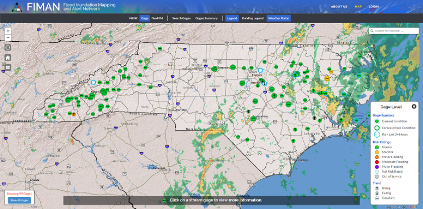
Real-time data management and visualization tell the story of floods and how to manage them. To infuse intelligence into their communities, flood management districts and emergency management agencies are using sensors to detect and map the threat of rising waters and calculate estimated impacts.
Public Web maps, dashboards and other map-based reporting tools are the perfect representation of IoE. They provide specific details in the common operating picture that would get lost in numbers-heavy documents. Maps, thus, are the most sensible aggregators and viewers of IoT data, from fleet to flood information.
Christopher Thomas is the director of government markets for Esri.


